after issuing the 2008 55-card 'premium' dodger team set, i was hoping for some variety with the 14-card blister team set. hopes were dashed. prepare to be underwhelmed with the 2008 side by side comparison. by now, you know the drill (here's the
2006 and
2007 comparisons) - the regular topps card is on the left, and the topps dodger blister team set card is on the right.
lad1 in 2008 was russell martin
and there is no other difference between the cards.
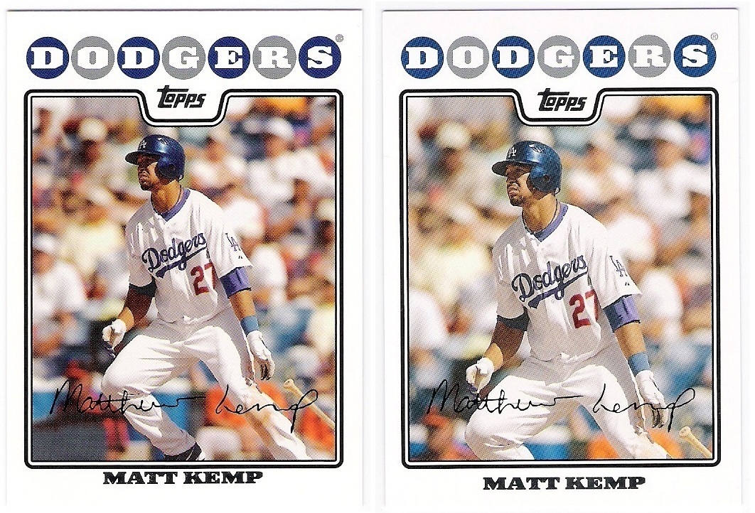
matt kemp is next
oooooooooooooooooh. a cropping variation. just like the 2007 topps-toppsdodgers luis gonzalez. the blister pack card cuts kemp off at the knees.
andruw jones
if ever there was a card that needed not to be reproduced, this was it.
sadly, topps didn't change a thing on the front. [edit] - topps did slightly adjust the cropping of jones' card. couldn't they have done more? use a better/real photo?
brad penny
no diff.
derek lowe
it's the same.
andre ethier
ahoy there. we have an enlarged facsmilie autograph on the team set card. not very exciting as variations go, however.
juan pierre
back to the same. it was nice to see pnc park get some love in 2008. it's at the top of my ballparks to see list, but i can't seem to pull the trigger on a trip to pittsburgh.
jeff kent
no variation
james loney
i was hoping for something as lame as losing the rookie cup a la martin in 2007. no dice.
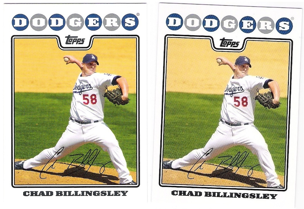
chad billingsley
no variation
jason schmidt
after two years of variations, topps played it safe with schmidt in 2008
rafael furcal
same
jonathan broxton
identical
finally, we get to lad14, joe torre
from grumpy gus to genial grandpa. the photo topps used in the base set was better intended for the heritage release with the vero beach bleachers in the background.
2008 was a low point for topps and these sets, although when one considers the 55-card dodger premium set it's hard to be too disappointed. we had
one two cropping variations, one autograph size variation, and one photo variation. 2009 will be better. stay tuned.


3 comments:
The Andruw IS cropped differently. I know, big deal.
you're right! that makes it worse somehow. to think they would make that change but not do anything to improve the image...
They didn't even do that gold/silver lettering variation thing that the base set did I think the Gold print was a short print or something that year. I took me two or three cards to notice it since it's hard for me to read damn shinny lettering anyway (It depends on what light I'm trying to read it in).
Post a Comment